


Meki studio, basé au nord de Poitiers est une association, dirigé par des étudiants. Elle a la volonté de promouvoir la culture autour de la musique et de l'audio-visuel, à travers des interviews d'artistes, des documentaires, des infographies animées et d'autres créations.
J'ai été impliqué dans le projet pour développer l'identité visuelle de l'association.
Meki studio, based in Poitiers — France is a company, aka school project, aka studio, aka collective, aka activité complémentaire de formation, driven by students. It has the will to share culture around music and film-making to the world, through interviews of artists, documentaries, infographics and other various creations.
I got involved in this project to direct the visual identity of the studio.


Des lignes droites et épaisses, avec des angles tranchants confèrent au studio et à son contenu un air sérieux et innovant.
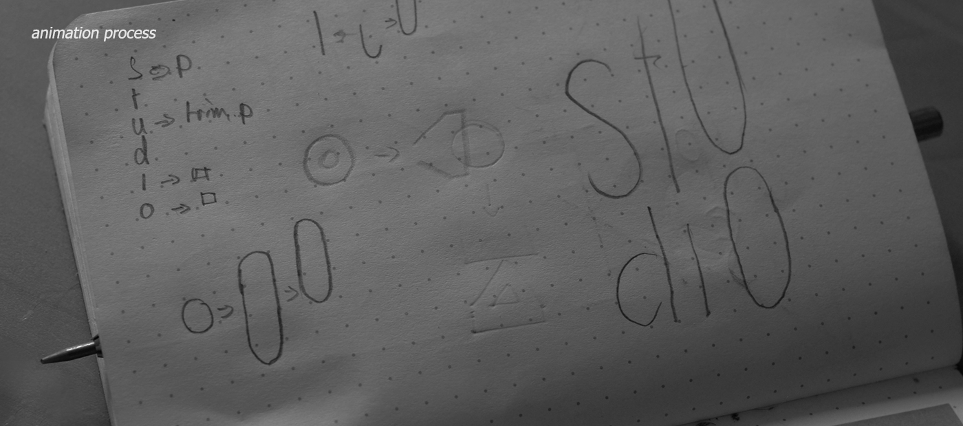
Déformer la police de caractère Futura au sein du logo est une analogie avec l'objectif de l'association : innover dans un espace déjà connu de tous.
Straight and bold lines with sharp angles identify the company and its content as serious, yet innovative.
Distorting Futura inside the logo is an analogy with the brand, which aims to make something new in an already well-established space.

Deux enjeux sont pris en compte dans le choix de la police : sa compréhension et sa facilité d'utilisation.
Tahoma fut un choix à la fois graphique et visuel. Cette dernière a une approche traditionnel des linéales humanistiques du XXème siècle, elle convient parfaitement pour tout type de communication, ce qui est un enjeu important lorsque l'on communique avec des étudiants.
D'un autre coté, Tahoma vient pré-installé sur les systèmes d'exploitation Windows, ce qui la rend facile à manipuler pour les étudiants.
Two objectives were considered in choosing the right typeface : its comprehension as well as its ease of use.
Tahoma was both a visual and practical choice. It has a traditional sans-serif approach, therefore it perfectly fits for all types of expression needed, which is important in order to communicate with students.
On the other hand, Tahoma is a pre-installed typeface on Windows operating systems and thus comes quite handy for students to use and manipulate.


Les couleurs choisies devaient marcher à la fois dans un environnement en aplat, ainsi qu'en transparence sur des images animés. Trois teintes saturés visent à renforcer le sentiment d'innovation, balancé par un gris foncé pour garder du sérieux.
The palette chosen had to be working both in a flat environment as well as overlaid on top of images. An energetic color trio aims to reinforce the feeling of innovation, but in an effort to keep it serious and credible, the mood is balanced with dark gray.


L'animation du logo devait trouver l'équilibre entre être suffisamment discrète pour prendre place superposée à une vidéo, tout en restant visuellement intéressante, J'ai donc opté pour un mouvement continu pour la partie principale (MEKI), en tension avec les éléments secondaires saccadés (studio).
Giving life to the logo had to be discrete enough so it could take place on top of a video.
Keeping this idea in mind, I went for a single smooth motion for the main part (MEKI), contrasted with stepped movements for secondary elements (studio).


Thank you for watching.
I'm open for work inquiries, drop me a line at martinlemairee@gmail.com


